I don't really like art. First, I'm horrendously awful at it and second, I just find it a bit pretentious, trying to make something out of nothing, a bit like Shakespeare. However, some art does catch my eye, this can range from a cow cut in half to giant slides (HOW IS THAT ART???), but the best type of 'art' is of course our beloved gaming art. Before the countdown begins I would like to explain that by 'art style' I mean the games with the best graphical art style, you know, coloured lines 'n' shiz.
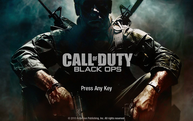
7) Borderlands
 |
| Cheeky! |
If ever a game crossed 5 genres, it was Borderlands. Its an RPGFPSMMO, yeah, pretty mental. However, the thing that Gearbox really established was the beautiful art style that set Borderlands apart from other open world-y games. The vivid black lines, exaggerated characteristics and dull but lively colours, Borderlands is one of those rare games that looks better when witnessed running than in a screenshot. Whilst the game wasn't incredible and suffered from a few niggles, Borderland's unique style has already influenced many future games whether it be Brink or highly anticipated Rage.
 6) Super Paper Mario
It is hard to pick one single Mario game that has the best art style. All games featuring the cheery little plumber feature a certain aesthetic, Galaxy is bright, Super Brothers is simple, but to me, the greatest Mario style has to be Paper Mario. Released in 2007, this adorable little franchise once again had innovative platforming that was perfectly paced and the amazing simplicity of Mario games, but lucky for us a new, a unique and stunning art style was lovingly included. The closest thing we have to a Mario comic, Paper Mario jumped out of our screen with its bold colours and detailed layers. However, the art style was also a large part to the actual game as it enabled the player to change perspectives to help complete tricky trips, resulting in an aesthetic, but practical implementation of the art style.
5) Shadow of the Colossus
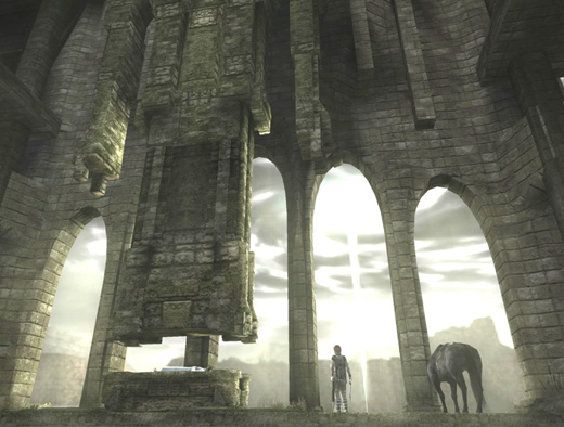 |
| Its so deep and meaningful! |
La-da-da-da-da, yes yes yes, Shadow of the Colossus is an 'inspirational' game that 'shows gaming as a true art form'. I could write a whole blog post regarding this soulful masterpiece, but to avoid getting my tongue too far up gaming's arse, I will refrain from rambling. Through all the interpretations of the story and revelations of the ending, SotC's visual style is outstanding. Whilst most games on this list contain bright colours that burn your retinas, SotC relies on dank, dull colours. The muted greens and blacks at first seem a little lazy, but as the game develops the colours start to become part of the gaming, mixing with your aim, leading you places that you never need to go. Much like the premises of SotC, the visuals are simple. No fancy technical tricks. Team Ico used the art style to
be the experience, not to act as a gimmick.
4) Legend of Zelda: Wind Waker

It may not be the most loved Zelda game and maybe Link has received a better reception, but compared to Ocarina or Twilight Princess, Wind Waker had something that the latter sorely lacked, a truly distinctive style. Similar to Paper Mario, Wind Waker utilises the bold black lines, but replaces the smooth cuddly edges with more jaggy, harsher corners. This gives the game a more grown up, childish feeling, if that makes any sense at all. The simplicity was welcoming and although it becoming incredibly tedious, travelling across the stunning sea is a wonderful experience and a beautiful moment. The vivid contrasts between the colours makes the screen pop out, but somehow, not intrusive. It is a subtle 'pop', somehow giving the whole experience another layer under the initial picture. It succeeds in being memorable and it was a risk, but c'mon, its Zelda goddamit, you're going to love it whatever!
3) Bioshock

With our faces sufficiently melted from Bioshock: Infinite's E3 showing, it is quite mind blowing how the Bioshock series has developed. Released as the current gen consoles hit their stride, the original Bioshock shook us all. Never since Half Life 2 had we witnessed story telling so impeccably done in a FPS. One of the reasons why the Bioshock series will forever be cherished though is its incredible style and atmosphere. The first nudge of the left stick as you step out into Andrew Ryan's strange dystopia is an unforgettable experience. It is eerie, but welcoming, it is scary, but intriguing, it is mysterious, but lively. The underwater city of Rapture holds many emotions, all of which are shown through the muted colours. Greens and blues are prevalent, but the sudden shocks of colours give us glimpse of what Rapture may have been in its heyday. Dark and gorgeous, the Bioshock series is a forefront father of atmosphere through graphics, a trait which seems to be continued with the latest Infinite, another world of intrigue and mystery that us gamers can not wait to dive into (or fly).
2) Okami
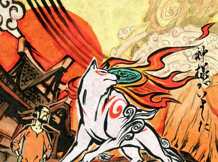

Okami, sadly, joins the lists of games like Beyond Good and Evil and my beloved Enslaved: Odyssey to the West. These games are all amazing games that took away the guns and grenades, instead opting for a new, unique experience that was a risk. Sadly, in terms of sales, the risk did not pay off, will games failing to sell. Okami is a sad tale. One screenshot of this game fills your heart with joy. Following in the crazy Japanese footsteps of random 'stuff', Okami introduced the technique of painting the surroundings with, well, paint from a wolf's mouth. Pretty Japanese I know! The art style is reminiscent of ancient Chinese art, conjuring the flat, muted colours that somehow bring a simple painting to life, filling it with more noise than possible. I cant really explain why Okami is so good, just look at it. It is incredible. Every single frame is created with such love and care that it makes the game seem like an epicentre of emotions, revelling in colour and exploding out across your screen, urging you to share the experience with everyone. Sadly though, Okami may never return, instead, another dull military shooter or stupid motion based game will fill the void, a void that will always be to large to fill
1) Madworld
 |
| AAAAHHHHHHHH!!!!!!!!!!!!! |
Here it is, the greatest gaming art style ever. This is my view by the way, art is wonderful in that it allows millions of interpretations, maybe Bioshock beats Madworld, or maybe Paper Mario pips the competitiors, but in my mind, 2009's Madworld is the most stunning, beautiful piece of gaming to be created. And why? Well read on, there's still a big chunk of writing to go, go on, READ! I have used the word simple on here a few times, but what is more simple than black, white and red? Well maybe, black and white, or just black, but hey, you get the idea! Platinum games are known for their mental games, look at Vanquish and Bayonetta, but Madworld makes them look like a stroll in the park. Madworld utilises a black and white palette but when you kill someone, which you will do a lot, bright red blood will explode from the screen, covering your character in the gooey fluid. The style is proper 'style', it is edgy, it has attitude, it is a big middle finger to colourful games like Uncharted or Fifa. Madworld is made to be mental, and it doesnt care what you think. The actual design is simply stunning, somehow creating a living setting with the incredibly limited use of two colours. The blood looks gory and gorgeous, whilst also being damn hilarious and disgusting. Just look at it. See, when someone puts their mind to it, art
can be interesting!